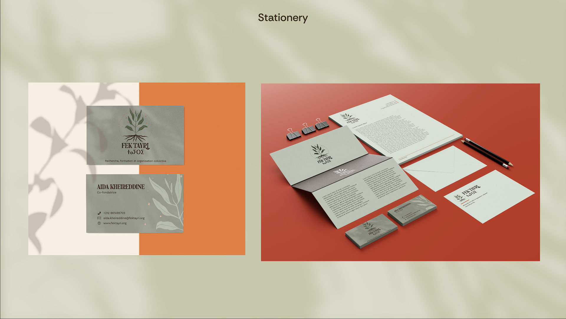
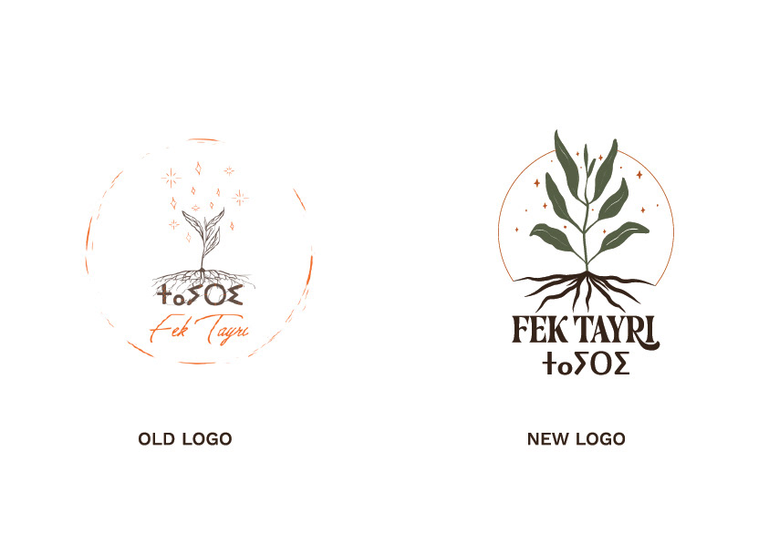
The new Fek Tayri logo represents resilience, growth, and interconnectedness. At its heart is a plant with visible roots and leaves, symbolizing balance and harmony between heritage (roots) and progress (leaves). The surrounding stars and circular arc suggest guidance, continuity, and a celestial connection, evoking the idea of enduring hope and inspiration. The typography combines classic, bold lettering with subtle curves, embodying a fusion of tradition and modernity. The use of Amazigh script alongside the Latin alphabet reinforces cultural identity while embracing inclusivity. The warm, earthy tones—green for growth and life, brown for grounding and roots, and orange for warmth and energy—create a palette that feels both welcoming and organic.